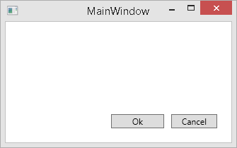
When designing a button bar in WPF I discovered a strange behaviour of the UniformGrid. My buttons did not look very uniformly.

The source code as follows:
<Window x:Class="MainWindow"
    xmlns="http://schemas.microsoft.com/winfx/2006/xaml/presentation"
    xmlns:x="http://schemas.microsoft.com/winfx/2006/xaml"
    Title="MainWindow" Height="430" Width="662" ResizeMode="CanResize">
    <Window.Resources>
        <Style TargetType="{x:Type Button}">
            <Setter Property="Control.Padding" Value="14, 1" />
        </Style>
    </Window.Resources>
    <DockPanel Margin="20">
        <Grid DockPanel.Dock="Bottom">
            <Grid.ColumnDefinitions>
                <ColumnDefinition Width="*" />
                <ColumnDefinition Width="Auto" />
            </Grid.ColumnDefinitions>
            <UniformGrid Grid.Column="1" Rows="1">
                <Button>Ok</Button>
                <Button Margin="10,0,0,0">Cancel</Button>
            </UniformGrid>
        </Grid>
        <Grid></Grid>
    </DockPanel>
</Window>
You might spot it right away (if not, the following image shows the buttons vertically aligned): the Ok button is slightly wider than the Cancel button. Actually it is as wide as the Cancel button plus its margin.

How come? The documentation of the UniformGrid states:
A UniformGrid arranges child elements within equal, or uniform, grid regions. UniformGrid is not a variation of the grid panel; it can be more accurately described as a tiling layout element because it creates equal spacing between each element that it contains, based on the number of rows and columns you specify. You can specify the number of rows and columns under Common Properties in the Properties panel. As you add child elements to a UniformGrid, each element is placed in a region starting from top-left to bottom-right until the UniformGrid is filled. This is useful for a control such as an image list.
The "grid regions" are not just consisting of the controls but also their margins. The UniformGrid arranges two grid regions here, one consisting of the Ok button (no margin), and one consisting of the Cancel button with its left margin. Both regions are sized equally. Unfortunately this does not look uniformly because our eyes rather concentrate on the button sizes without margins.
The easy solution here is to make all margins equal:
            <UniformGrid Grid.Column="1" Rows="1">
                <Button Margin="10,0,0,0">Ok</Button>
                <Button Margin="10,0,0,0">Cancel</Button>
            </UniformGrid>
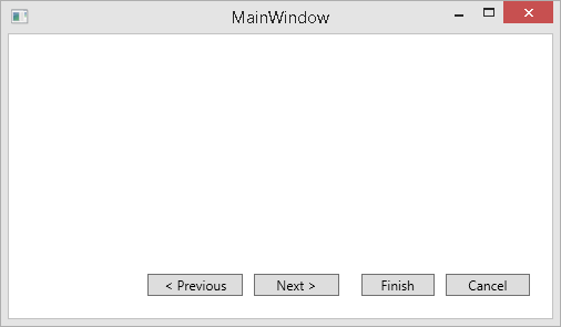
But that is only a solution up to the moment when you design a button bar for a wizard dialog having different margins between "Previous", "Next", "Ok", and "Cancel" as you can see here:

But that's another story.
